Antonio Tejero invited me to create the visual identity for his new agency, Fénix, with the intention of shaping a project that embodied both a new beginning and a clear creative statement.
From the outset, the symbolism of the phoenix emerged naturally. As the concept evolved, the bird gradually moved away from a literal representation, giving space to a more open and suggestive identity system.
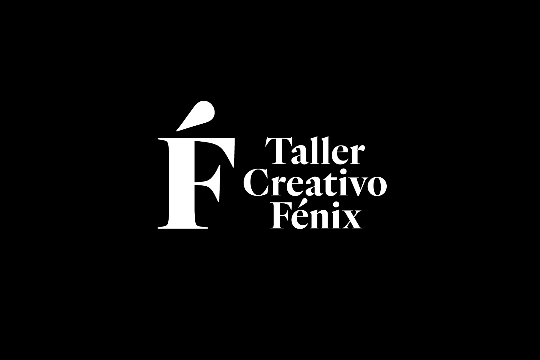
The process ultimately led to an unexpected typographic solution, where typography became the primary creative device, capable of conveying renewal, curiosity and confidence without relying on illustrative symbolism.
From this approach, Taller Creativo Fénix emerged as a natural evolution of the project, reinforcing the ideas of rebirth, craft and creative process. The notion of a taller (workshop) introduced a more hands-on, human and experimental dimension, closely aligned with the founder’s vision and with a way of understanding creativity as practice, research and continuous transformation.
The resulting identity provides the agency with a coherent, flexible and distinctive visual language, built around a strong typographic core, supporting its positioning while allowing it to evolve over time without losing its conceptual strength or original intent.